


Kimberly-Clark Professional
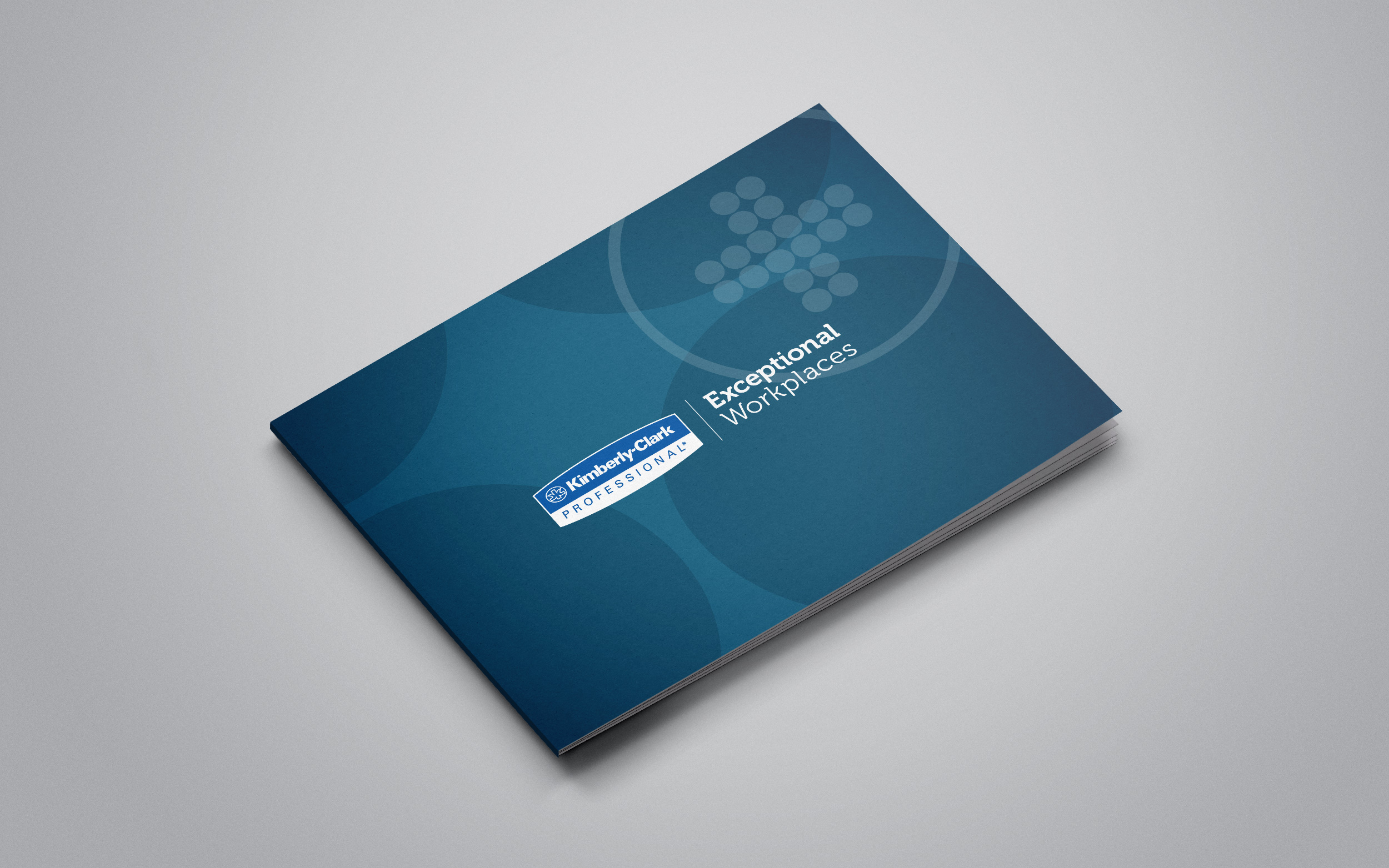
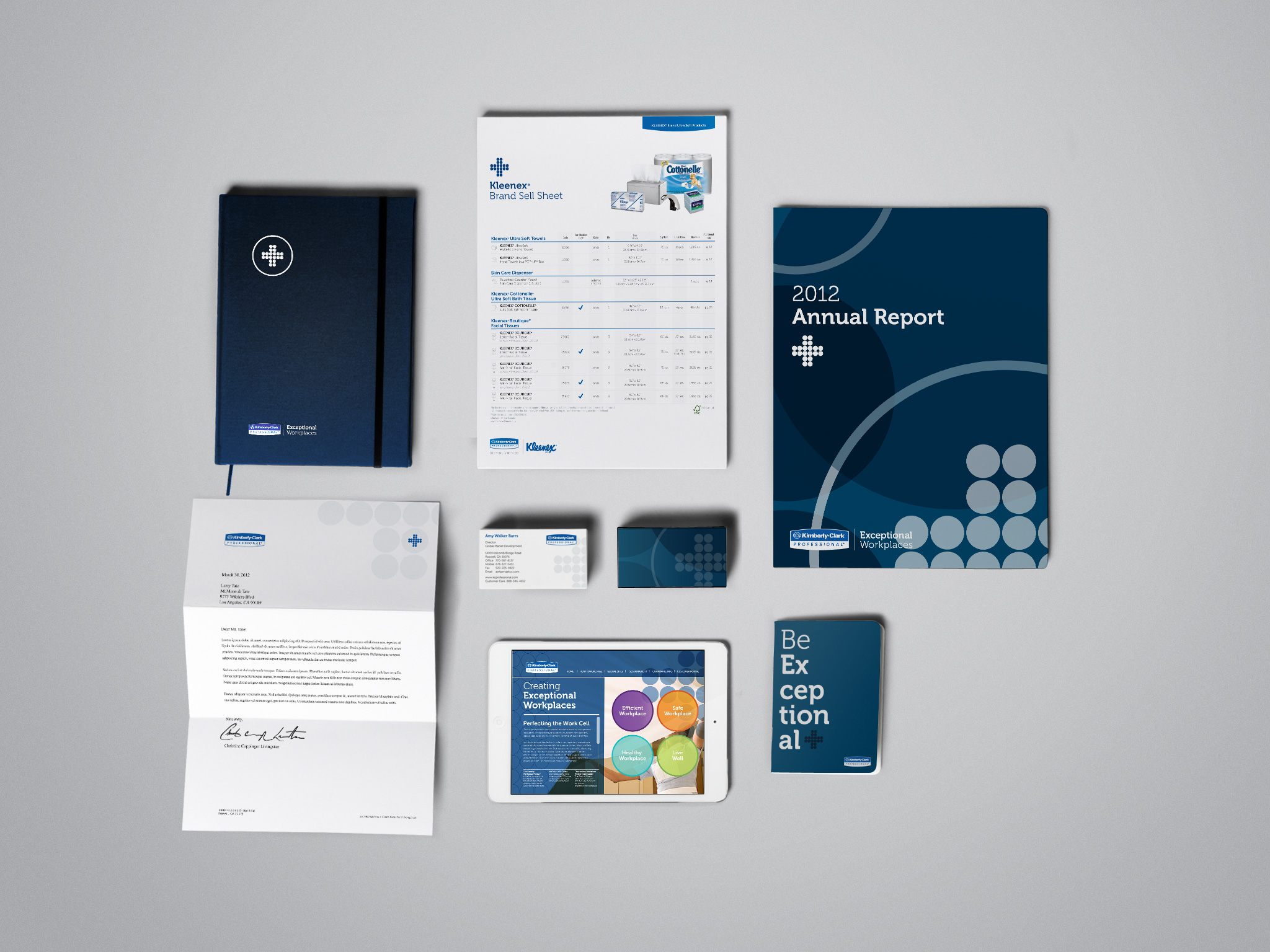
Tasked with unifying the four branches of the Kimberly-Clark Professional brand, safety, healthy, efficiency, and corporate, a complete brand identity redesign was developed around the concept of connecting. The Connecting Point symbol was created and each branch designed to have a distinct look and feel with layering, simplicity, complexity, color & images.
DESIGN DIRECTION: DAVID WEINBERGER
COMPANY: CBX
2012